|
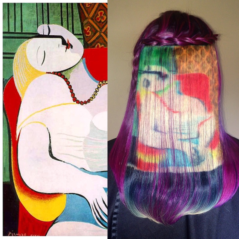
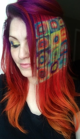
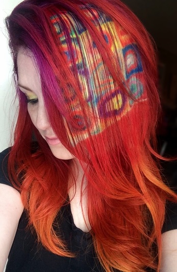
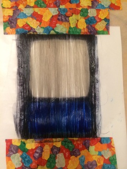
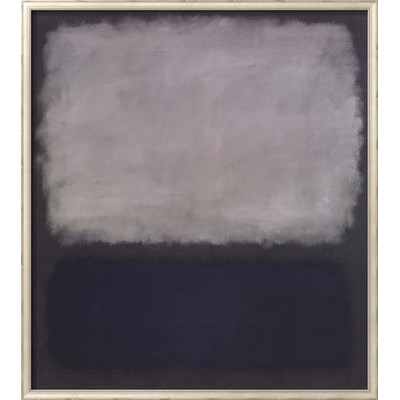
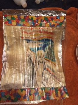
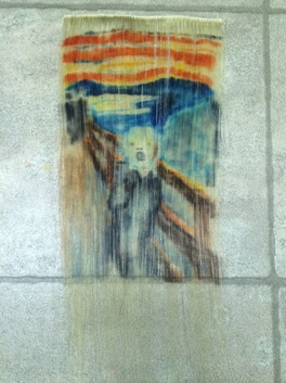
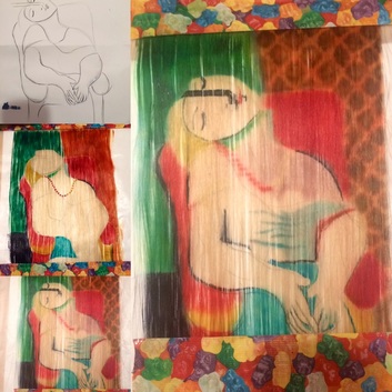
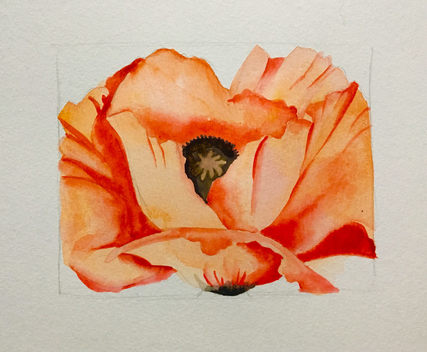
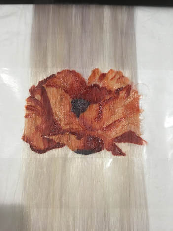
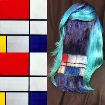
Updated June 5th, 2016 So back in December, while I was in the middle of doing Airacha's Van Gogh colored hair, I had an idea. I wondered how hard it would be to actually paint Starry Night - the painting - onto some hair. I thought it might be fun to try painting on hair instead of a canvas (for everyone needing a reason why I do anything). So the next day, I started working on painting it onto a hair weft (a thin slice of hair like that used for certain types of extensions) to see if I could work something out. The original weft I started on was too thick, and I realized I needed a thinner weft, so I purchased one. Then I got distracted by the idea of doing other paintings on the thinner hair, and I neglected my Starry Night project in favor of trying out The Scream, by Edvard Munch and La Reve, by Picasso. And they actually came out...pretty okay. And it was surprisingly fun to do; I started to really enjoy myself once I worked out a few kinks. I wanted to keep going, but got sidetracked by other stuff happening for a little bit. When the Fine Art series went viral, there were more than a few commenters who responded to poorly worded headlines on the subject with statements like, "I thought I was going to see actual artwork on the hair" or "These are just the colors from the paintings, not the ACTUAL paintings" (yeah, no duh, but I'm not the one who wrote the headlines suggesting otherwise, am I?). I wanted to point out that I was actually working on exactly what they were complaining about, but figured I ought to do a few more before I put them out. Plus, who cares about what gripey commenters want? I also wasn't sure how well they'd turn out, and didn't want to promise something I couldn't deliver. So I continued playing around with the idea, discovering that it was a bit trickier than I originally thought. I spent a lot of time looking through art books and thinking about what sorts of things I like to paint, trying to decide what would be the most fun and interesting to do. *Side note: I don't think my own original art is terribly interesting to anyone but me, and my best skill set lies in realism/photorealism - which basically means I'm good at copying things. So that's why I felt like it was more fun and interesting to reproduce other artists' stuff. My own art is mostly for me or people I'm very close to. No, I don't do commissions. No, I don't sell my own art. If you get art from me, it's because it burst out of my brain specifically for you and I wanted you to have it. Which is also why I don't have a thriving career as an artist. When I mentioned to a friend that I was considering a Kandinsky reproduction, he thought I was being too ambitious. So then of course I HAD to do it. Then he suggested that I do a Rothko, since he was a fan, and so I encouraged him to pick one out for me to do. And then it just kind of kept moving forward. So now I have completed several, and am working on a couple more, and have ideas for a few more that I haven't started yet. I think I'll work on them till I get bored. I honestly haven't painted this much in years, and it feels good to be productive, even if it's on a silly project like this one. I've also learned a lot about each artist and their style in the process of doing the paintings, and that has been a cool and unexpected side effect; I feel more appreciative of their work and process now. Some of the pieces I tried to copy as closely as possible, some I took some creative liberties with. For instance, it wasn't practical for me to place all the red dots on the Lichtenstein(?) as close together as they are in the original, as the red dye would have likely bled all over the damn place and it would have looked sloppy. And I started "Starry Night" from memory, as I've painted it numerous times, and so the composition is off a bit, although I ultimately corrected a lot of it. Some of the pieces I did a very basic sketch or outline and then worked from that, but for a couple, like the Kandinsky, I did my own full reproduction on paper first and then used that to work from. I used actual hair color; mostly direct dyes but I did use permanent colors a few times for specific effects. I used multiple lines, including Manic Panic, Kenra, Joico, Redken, Rusk, Pravana, Ion, Adore, and Arctic Fox. I typically watered them down a little, and then applied them to blonde hair with a paintbrush (mostly sable, like the same ones you use for painting anything else). I freehand them - no projectors and NO STENCILS. I lay a drawn or painted mock up underneath to sort of "trace" it - but like I state above, I've drawn or painted the mockup myself. That's it. That's my process. 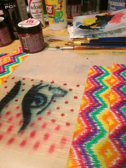 My work area. I hijacked my son's desk behind the couch. This annoyed him to no end, as it seriously interfered with his Minecraft gaming and poisonous snake research. In this case, I thought I was working on a Lichtenstein, but my research has not yielded whether or not this was actually one of his pieces. Regardless, I finished it anyway and liked the outcome. Does anyone know the original source for this? If so, you might mention it in the comments and post a link to your source, please and thank you. 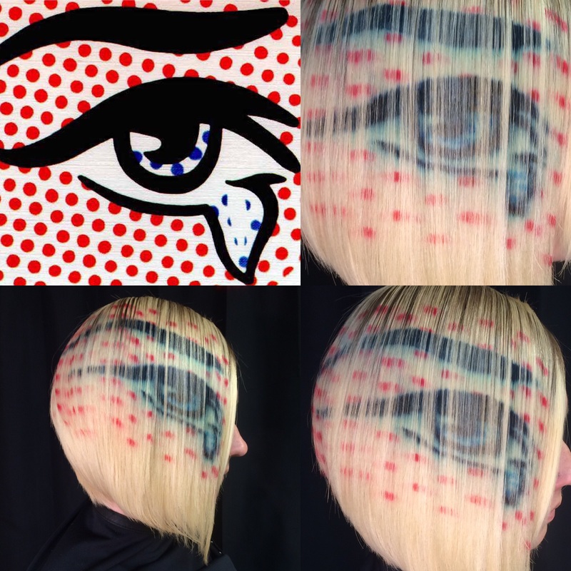 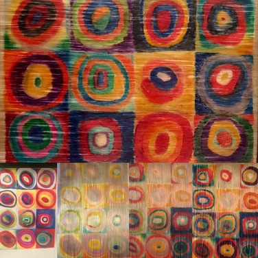 The very bottom left photo is the (sideways) watercolor reproduction I did of Wassily Kandinsky's Color Study: Squares with Concentric Circles, and I used that as my template for the hair, of which the top photo is the final product. It wasn't as easy to paint as I had initially predicted, and I ended up having to plan it a bit more than I thought I would. I REALLY liked how this one came out. I feel tempted to do my own similar color studies because this one was fun to do.
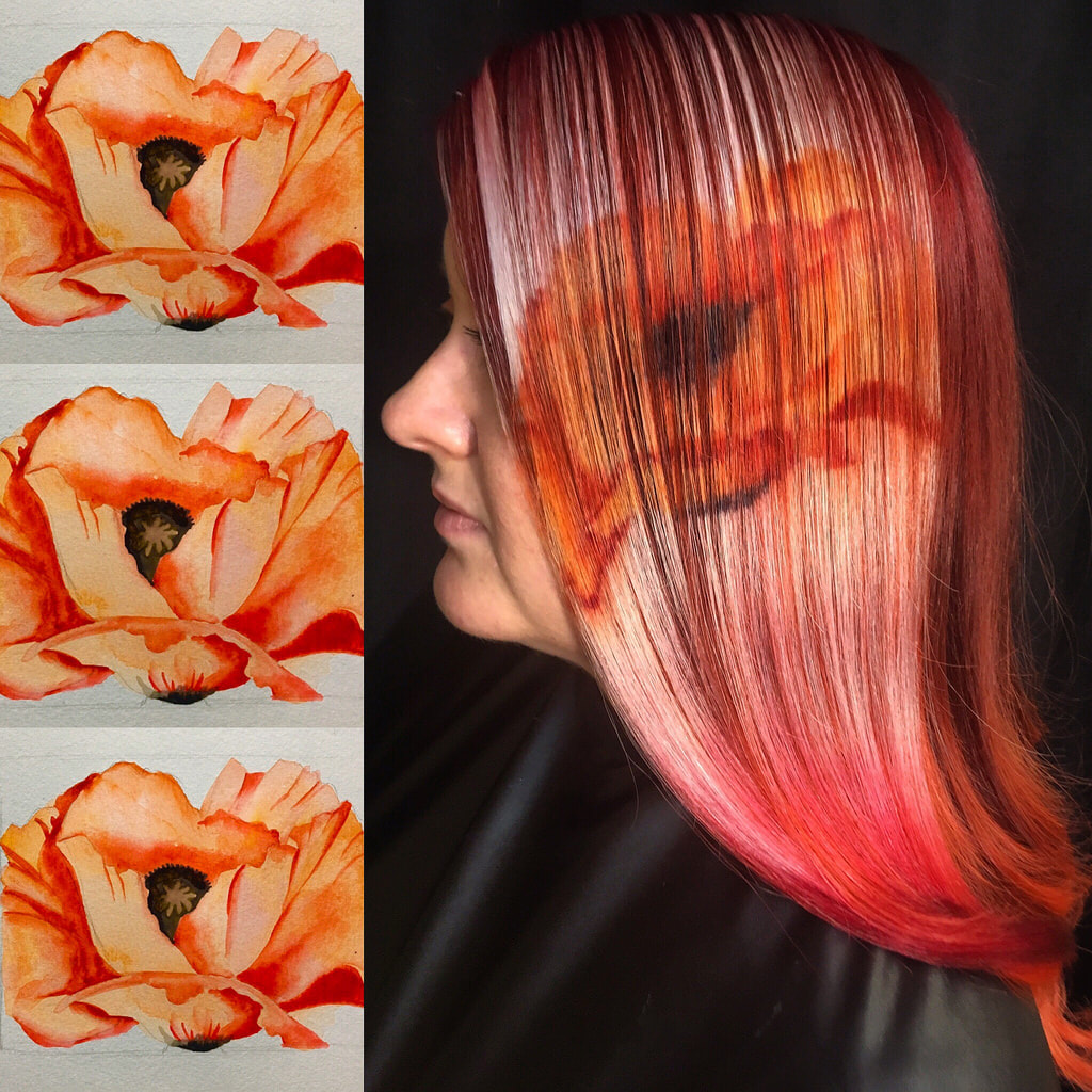
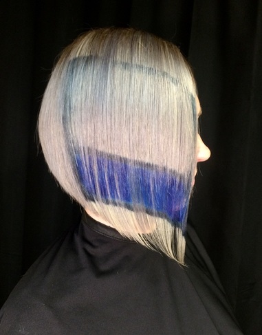
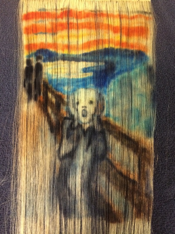
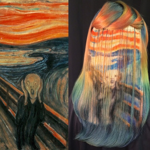 But I decided to give it another chance and work on it just a little more, and then get some pictures to see how it looked on camera. I asked Tessa to model it for me, since we had just colored her hair in roughly the same colors a couple weeks prior. I didn't realize her reds would fade to PERFECT oranges, and that the steely color we had added at the roots and tips would match the discordant tones of the painting's color palette so well. Once her hair was styled with the piece in, I started to really love it. I still love it. I think it's totally my favorite. Here's another pic because I just love it so much. 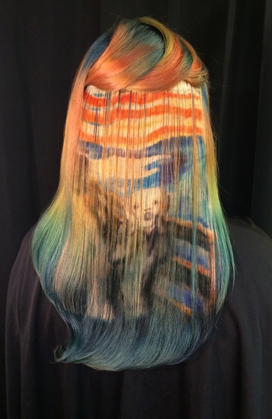 UGH. This damn thing. This one was really hard. But I love Van Gogh - LOVE HIM - so I had to do it. 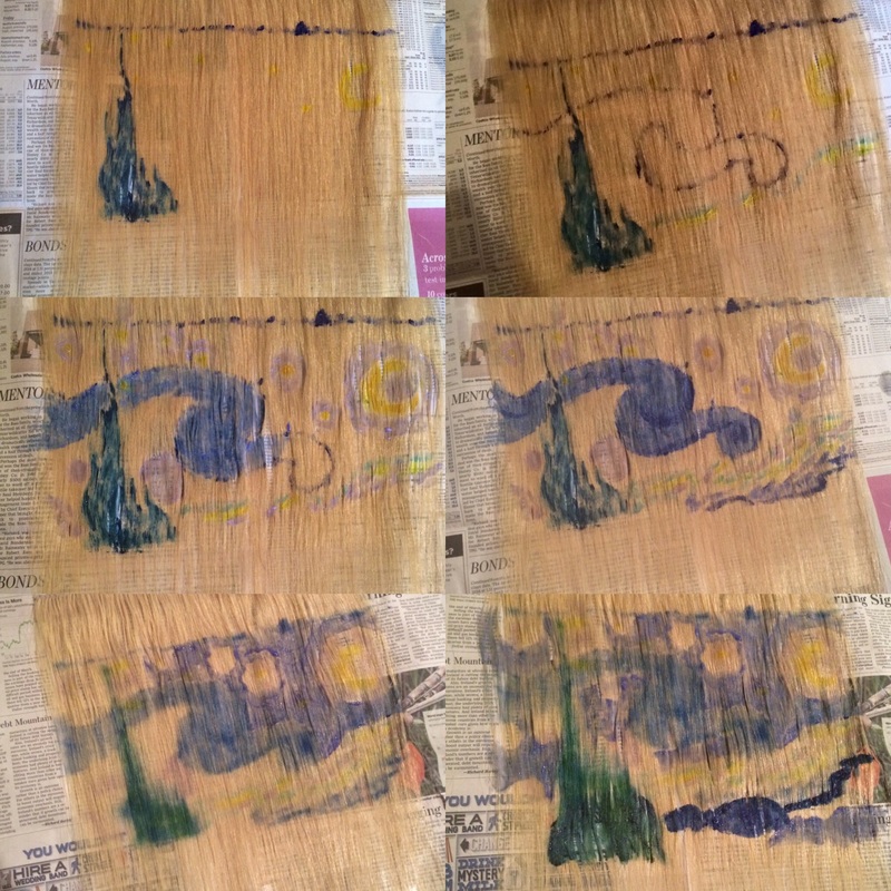 FIRST OF ALL, obviously, Van Gogh's painting style is a real pain in the ass to do on hair. I still don't feel 100% satisfied with it, and I may keep playing around with this thing. I probably painted and repainted the sky maybe 4 times? It's a lot like watercolors, where you have to utilize the white of the paper (or in this case, the hair), for lighter colors and whites. There's no "white" hair color, technically. Like, if I color a spot blue and then decide oh crap, that should have been white (or light blue, or yellow, or any color lighter than blue), I can't just go over it with light blue or white or yellow hair color like you could with, say, acrylic paints. So it takes a lot of careful planning and you have to sort of start from light to dark, gradually filling in darker areas with color and just...not really touching the lighter areas, or being very, very careful with them and working around them, the way you would with watercolors. Second, I will probably also get other photos; this one was the first one I put in hair, and I honestly had no idea where to start or what to do with it - I was just sort of winging it. I've since straightened out and cleaned up that bottom edge, now I just have to...I dunno. Something. So. We will call this one a work in Progress. 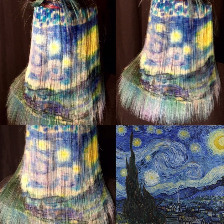 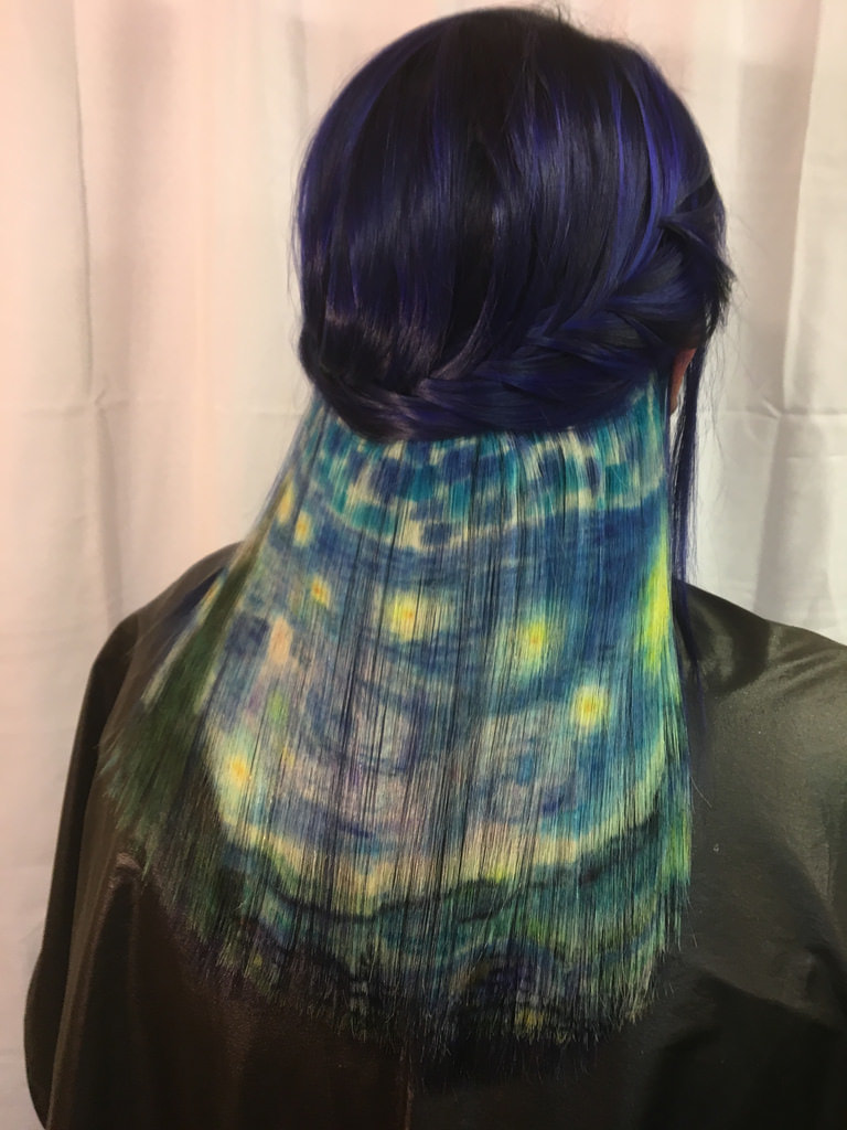
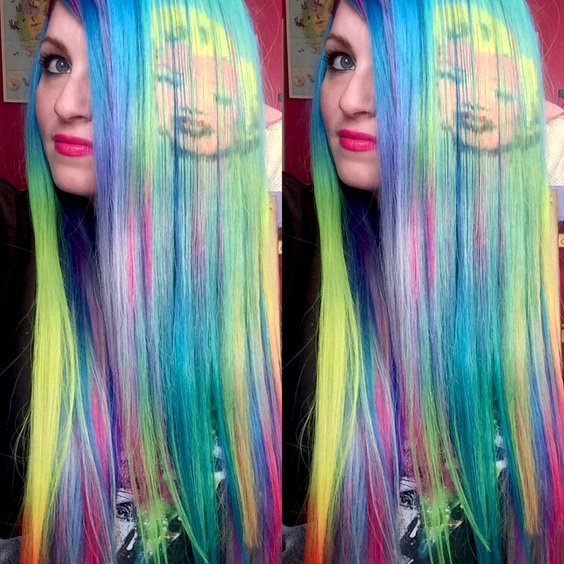
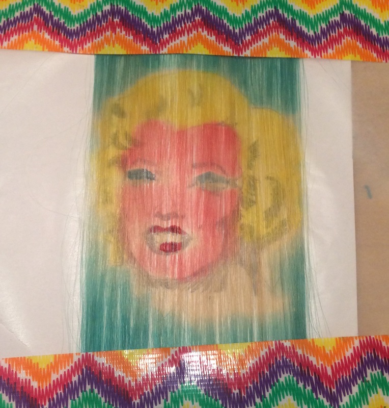
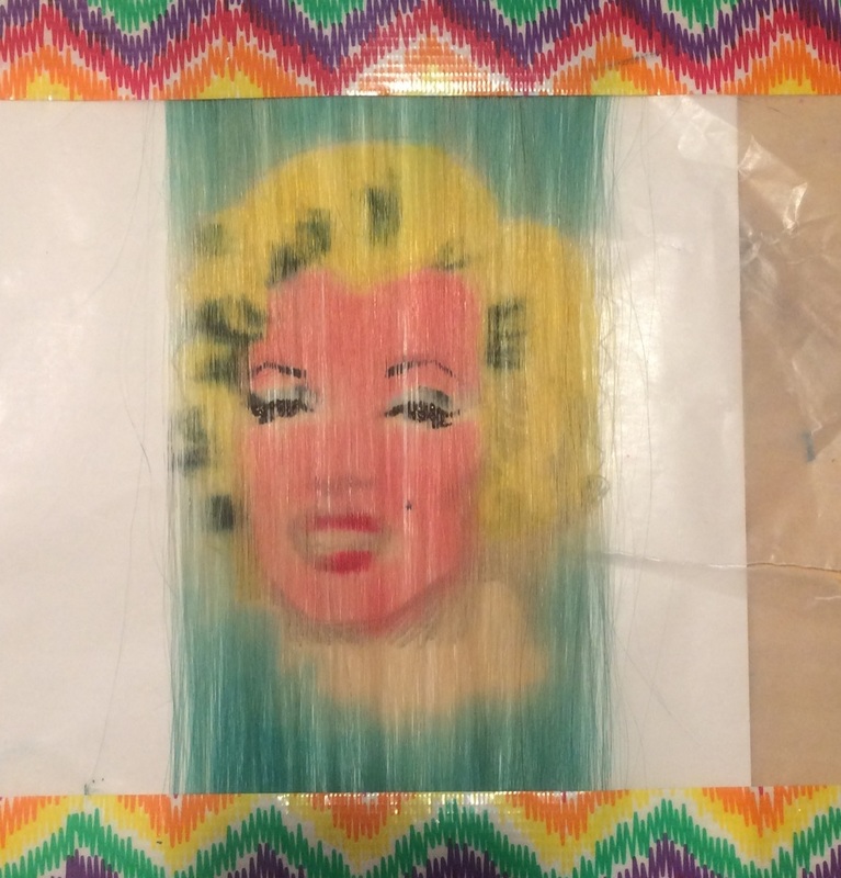
 So of course I had to do a Warhol. I love his Marilyn portraits, and this one kicked my butt. Her face was very difficult - the individual parts of it were so small and detailed that I was not able to reproduce them as well as I would like, and so she's not quite perfect. I also did it a bit like Warhol would have - I did each color in its own respective section, like you would for screen printing, and then ultimately went back over it with black to fill in. And then it matched my neon rainbow extensions really well, so that's what I modeled it with. 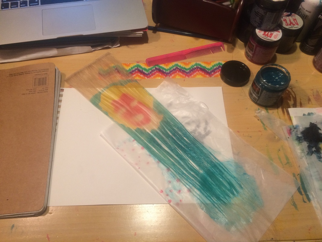
 If you wanna see the originator of the Faces in the Hair idea, check out DJ Victory's website at djvictory.me. She also has had some other amazingly innovative ideas, like stained glass hair and tie dyed hair, plus, she is a super sweet and genuinely nice person. I've got a few more I'm working on, and a few more I'd like to do. So I will update this post with new developments as they happen. Also, thank you to my models - Shelby, Katie, and Tessa. They are all existing clients of mine, and generously donated their time and hair for this project simply to indulge me, and also because they are awesome friends. I'd have no career to speak of without them! Update:
For something a little different, I decided to give Banksy a shot. I tend to really like most of his stuff, but the bigger challenge here, for me anyway, was the simplicity. I wanted to see if I could make it work without having to fall back on color to make it eye catching. Being such a detail junkie who easily and happily will overwork everything, this presented a unique issue for me: it only took a few minutes to paint, and then it was done. My brain didn't know what to do with that, and I hemmed and hawed about it at my desk after it was completed, wondering if it needed "more". It took a tremendous amount of self-restraint for me to stop here, but I'm glad I did - I think it makes a pretty good impact as-is. Plus, it got me another nomination in the Behind the Chair magazine one shot awards, so that's cool. 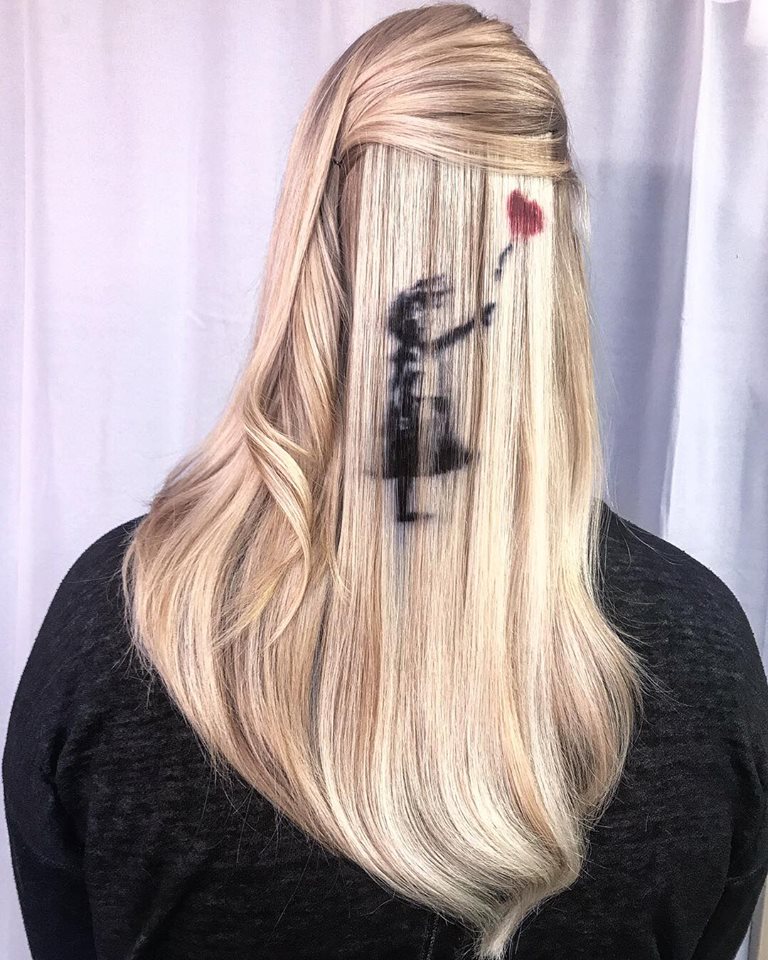
12 Comments
Maureen
5/30/2016 05:46:05 pm
Amazing. Simply amazing.
Melisa
5/30/2016 06:29:42 pm
Oh my wow. That's unreal. I'm in absolute awe.
Donna
5/30/2016 06:44:00 pm
Awesome Ursula!
Aurora
5/30/2016 07:46:52 pm
I'm a huge fan already, and I only recently found you via FB. I'm finding your process - as documented here - as amazing as the results, which thrill me. THANK you for going so far outside the box and exploring these possibilities..... My eyes are greedy for more!
Danni Gess
5/30/2016 07:54:30 pm
You've done what I've always fantasized doing..granted, I have no real discernible talent in painting (ha!) but a lifelong obsession with art museums, art galleries and books on art history.
Amber Unruh
5/30/2016 08:38:47 pm
Great job sista girl! Great delivery! 💜
Teri Robbins
5/30/2016 09:00:54 pm
You amaze me. I love all your artwork in hair and on canvas.
Tessa
5/30/2016 09:50:28 pm
You're Welcome! Your art amazing me everytime I see it in images or in the mirrior. I'm so blessed to call you my friend. I'm always learning from you. :) 5/31/2016 04:55:48 pm
I admire your honesty and creativity so much, Ursula. Thank you for sharing your hair artistry with us! You have continued to inspire me for years! 9/10/2016 06:48:56 pm
Your work is fantastic!! What a difficult project you've been brave enough to tackle--well done😊 Leave a Reply. |
Sometimes, I write.
Various brain regurgitations will go here. Categories
|
 RSS Feed